Ever wondered why fast-food chains often use red and yellow, or why Facebook is blue? There’s more to it than meets the eye! Colors have a profound impact on our daily lives, influencing our emotions, perceptions, and even behaviors. Understanding color psychology is crucial for branding because the right colors can evoke specific feelings and actions in your audience. In this post, we’ll dive into the fascinating world of color psychology and explore how you can harness it to create a brand that truly resonates with your audience.
What is Color Psychology?
Color psychology is the study of how colors affect human emotions and behaviors. Historically, colors have been used for their psychological impacts, dating back to ancient civilizations that utilized color for healing and spiritual purposes. Today, scientific studies continue to explore the powerful effects of color on our mood and decision-making.
Impact on Human Emotions and Behavior
Different colors can evoke specific emotions and reactions. For example, a 2010 study found that warm colors like red and yellow can stimulate excitement and urgency, while cooler colors like blue and green promote calmness and trust. These emotional responses are why certain colors are strategically used in branding to influence consumer behavior.
The Meaning of Different Colors
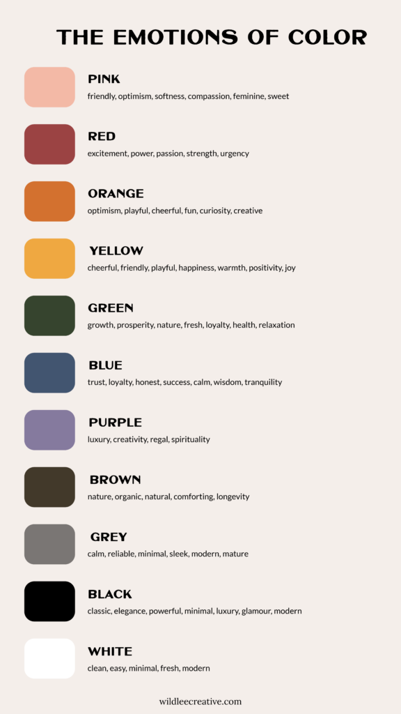
Here’s a quick rundown of what different colors represent and how they can be used effectively in branding:

Applying Color Psychology to Your Brand
Identifying Your Brand’s Core Values and Personality
Start by identifying your brand’s core values and personality. Reflect on what makes your brand unique and how you want your audience to feel when they interact with your brand. You can do this by writing down three words that describe your brand. Now think about the colors that best represent these words. As an example, if your brand is all about happiness, energy, and warmth, you might lean towards yellow and orange.
Choosing the Right Colors for Your Brand
Match your brand’s values and personality with the appropriate colors. Look at successful brands for inspiration. For example, Apple uses white and grey to emphasize simplicity and sophistication, while Target uses red to evoke excitement and energy. But, if you as the founder really dislike a color, don’t use it. Since you’re likely a smaller brand (and not on the Apple or Target level quite yet), you are the human behind the brand and the one who shows up on your website, social media, and in-person events. You want to embody the colors you choose. If you’re not in love with your branding, it’ll be harder to showcase it with enthusiasm.
Balancing Color Choices
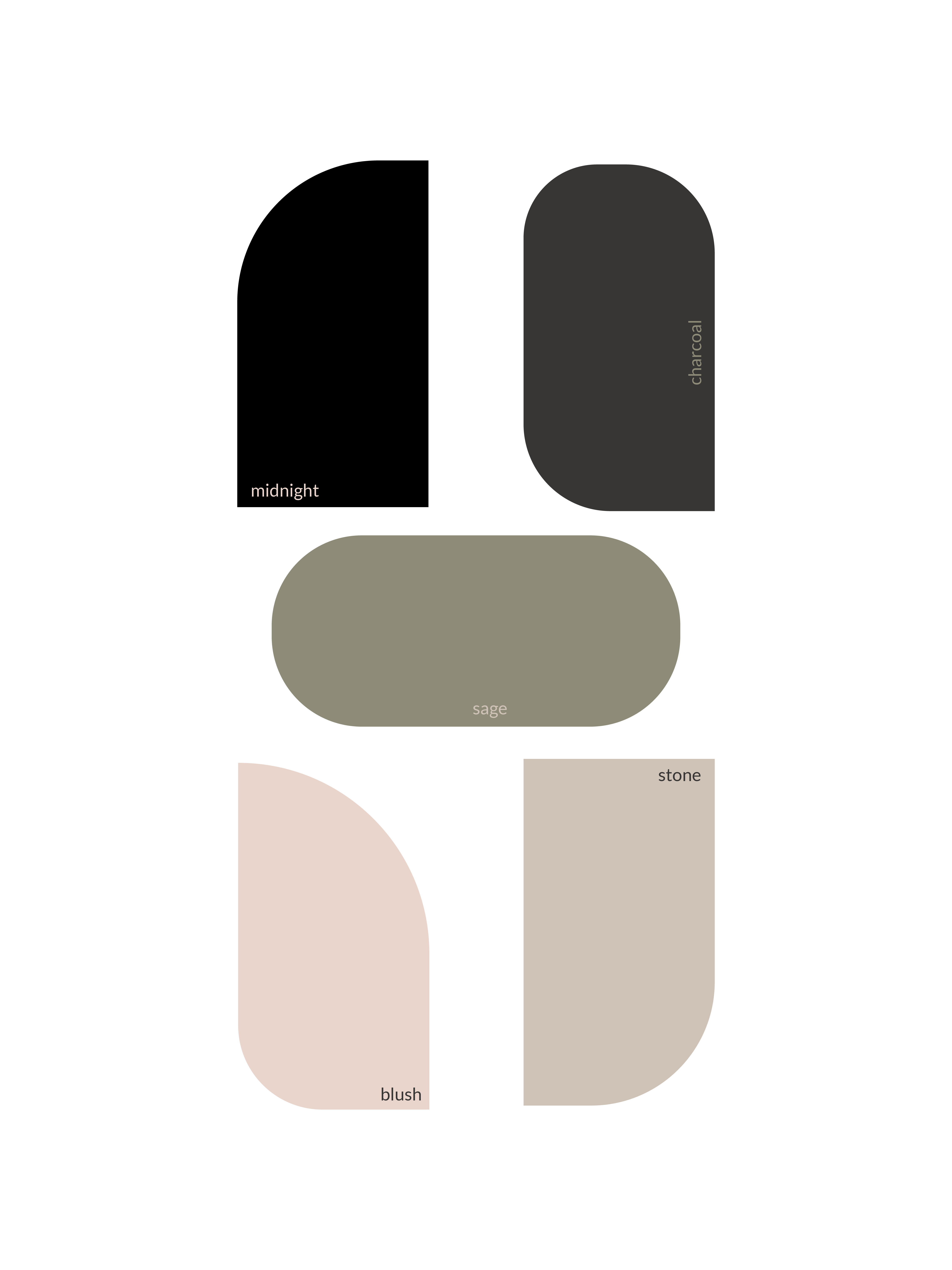
You might wonder how many brand colors you should have. Avoid overloading your brand with too many colors. A cohesive and harmonious color palette is key to creating a visually appealing and memorable brand. Generally, it’s recommended to stick to a primary palette of 3-6 colors to maintain consistency and avoid overwhelming your audience. However, remember that it’s more of an art than an exact science. Each brand is unique, and your palette should reflect that!
Case Studies and Examples
Successful Brands and Their Color Choices
- Target: Target’s red evokes excitement and energy, aligning with the brand’s lively and youthful image.
- Starbucks: The green color symbolizes growth, freshness, and relaxation, perfectly reflecting the brand’s commitment to quality and sustainability.
- Facebook: Blue conveys trust and dependability, ideal for a platform focused on connecting people globally.
Practical Tips for Using Color Psychology
Incorporate your chosen colors into all the places where your clients or customers interact with your brand. From your logo and website to print materials and social media, ensure your colors are consistent.
A great tool in Showit allows you to seamlessly integrate your brand colors into your site. Just go to your Design Settings and add your Hex color codes. Canva is also a fantastic platform for creating marketing materials that align with your brand’s colors. By adding your Hex color codes under the Brand Kit section, your colors will be right there whenever you’re designing graphics. This helps maintain color consistency across all platforms and materials.
Understanding color psychology is essential for creating a brand that resonates with your audience. Colors influence emotions and behaviors, making them powerful tools in your branding strategy. Be bold and creative with your color choices. Experiment with different combinations to see what best represents your brand’s personality and values.
If you’re ready to elevate your brand using color psychology, reach out to chat! Let’s create something truly extraordinary together.
I’m passionate about creating cohesive branding and websites that are not only beautiful, reflecting your unique vision, but also drive meaningful results. I blend nature’s beauty and refined design with strategy to build purposeful brands + websites that transcend the ordinary and resonate with the wild at heart.
Website Builder. Brand Designer. Outdoor lover. Dessert Enthusiast.
Hi, I'm lexi.
A custom website built in Showit to be seen as an expert in your craft to charge higher prices, reach more people, be confident in your online presence and build something big that is full of heart and purpose.
Elevate your brand and start building a strong visual identity. We establish (or refresh) your brand identity by incorporating purpose and strategy to get up and running and start attracting your ideal client.
